Notes on Hello Web Design: Design Fundamentals and Shortcuts for Non-Designers
Hello Web Design: Design Fundamentals and Shortcuts for Non-Designers by Tracy Osborn
Original notes here.
Read until the end to get a bonus. Enjoy reading.
Commonly used examples account for 80% of real-world cases; forcing the remaining 20% into code takes a disproportionate amount of extra time. The purpose of this book is to teach readers just enough design concepts to get by.
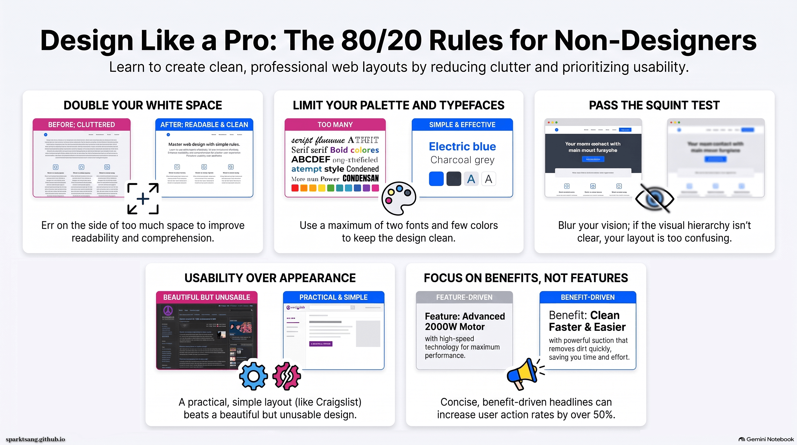
Usability over appearance: Craigslist has stuck to an outdated but practical style for many years.
The biggest principle of good-looking design: reduce clutter. Examples include:
Use grids, reduce the number of colors, limit yourself to two typefaces, simplify, and leave white space.
Grids
Grids are essential for maintaining order and consistency. Strongly recommend using a CSS framework that includes a grid.
Color
Color affects psychology: pink feels playful and innocent, while black feels sophisticated and cutting-edge.
Fewer colors and greater contrast make text easier to read.
It is useful to make greater use of color palette sites such as Adobe Color CC.
Typography
Typography refers to anything that makes text easier to read. Each typeface family, such as Arial, is divided into different fonts.
Serifs are decorative strokes at the ends of letterforms, and typefaces are divided into those with or without serifs. Body text should not be right-aligned (because it creates awkward, uneven spacing and “rivers” of white space) or centered (because it is not left-aligned and is difficult to read).
Free fonts are available from Google Fonts and Adobe Fonts.
Curated font sites can narrow down the choices, including Beautiful Web Type, Typewolf, Brick.im, and Font Pair.
White Space
If you can use only one tool, use white space:
A cluttered, crowded website performs far worse than one that is simple, has room to breathe, and contains less information.
White space improves website comprehension, increases readability, makes Calls to Action (CTAs) stand out, and establishes the overall tone of the design.
White space includes the space between lines, between elements, and between groups of elements.
Beginners should err on the side of too much white space and double the amount of space they think they need.
Layout and Hierarchy
Layout determines how information is arranged on a page and the order in which information is presented.
Most users scan websites following the “F-pattern”.
Hierarchy makes a page more interesting. Options include size, color, position, contrast, white space, and typography: larger items, highly saturated colors, elements placed in the upper-left corner, high-contrast items, elements with more surrounding white space, and heading typefaces all appear more important.
The squint test: blur the page, and the visual hierarchy becomes clearer.
If you cannot establish a visual hierarchy, readers cannot tell where the overall design begins or ends. This confusion reduces engagement and action.
Content
Keep it simple. Each paragraph should be no more than two or three sentences. Write much more and readers will only read 80/100/200 words.
Trying to make an article cover everything carries a huge risk: the 80 words a reader happens to spend time reading may be the least important part.
When something cannot be simplified, break it into sections and bold the key points.
Headlines should also be concise, emphasizing benefits rather than features. According to research by the Webprofits website, this can increase the action rate by 52.8%.
UX
The user’s overall experience is the most important part of design.
The two most important things are: the reader achieves their goal, and you achieve your business goal.
Analyzing the strengths and weaknesses of competitors is key to improving UX. Research and interviews are also important for understanding users.
Prototype testing can save time. A/B testing can improve the design. Add analytics tracking to the design to evaluate its effectiveness; Google Analytics is recommended.
Images
Most countries follow the Berne Convention, under which copyright belongs to the original creator even if they have not explicitly claimed it. Therefore, in practice, there is no need to put a copyright notice in the footer.
You can create excellent designs using nothing but typography, or simply screenshots of a software product.
File size affects loading speed. Keep the following principles in mind: make sure images are no larger than necessary, and serve different image sizes for Retina (high-DPI) and non-Retina displays.
Icons can make abstract content more concrete. Fiverr can be used to find people to design icons.
iStock has many assets, as do Unsplash, IM Free, picjumbo, Gratisography, and PhotoPin.
Miscellaneous Tips
Start simple.
Rule of thirds: divide an image into nine sections, three columns by three rows, and place the focal point at an intersection rather than in the center.
Pure black, which does not occur in nature, can make a design feel dull and unnatural. Headings can use #222222 and body text can use #444444.
When adding shadows or gradients, the light should come from above.
Use contrast to highlight content; explanatory text, for example, can be a lighter color.
Be aware that color effects are influenced by their surroundings; avoid placing text over images.
Real-world design often requires compromises between simplicity and functionality. Bloomberg Terminal’s professional interface is “deliberately” cluttered to facilitate rapid operation.
Design Process
The first step is finding inspiration. Examples include The Best Designs (note: now defunct), Unmatched Style, Awwwards, and Site Inspire.
Planning: determine which pages the website needs, such as Home, About, Portfolio, and Contact, as well as sitewide elements, such as the Logo, top navigation, and footer navigation.
Prototyping: turn your ideas into wireframes; they can be quick, messy, and simple. Sketching wireframes helps build out more detail. Use real copy so you know how much space it will require. Free software for this stage includes GIMP and Inkscape, while paid options include Illustrator and others. When necessary, use design software to create hi-fi mockups to work through layout details, but if you are unfamiliar with the software, this can take more time than coding.
Get feedback: ask what people are dissatisfied with so you can improve. You can start with the design_critiques subreddit on Reddit, or use testing services such as Five Second Test.
Coding: smooth operation is more important than aesthetics. There is no need to insist on originality. The Bootstrap design framework is very common, as are frameworks such as Skeleton, Foundation, and PureCSS. They impose some limitations but save time. Pay attention to compatibility across different screens (media queries can specify different CSS rules for different screen sizes, while Chrome DevTools lets you preview how the site looks at different screen dimensions). Also note that file size affects loading speed.
Analytics: the gold standard is Google Analytics, with Segment among the other options.
The design can always be improved through continual revision.
References
Recommended books:
Robin Williams “The Non-Designer’s Design Book”,
Ellen Lupton “Thinking with Type”,
Steve Krug “Don’t Make me Think, Revisited”,
A Book Apart
Blogs:
smashingmagazine.com
alistapart.com
useronboard.com
Courses:
skillshare.com/browse/design
studiofellow.com/theory-sprints
Inspiration:
dribbble.com
awwwards.com
unmatchedstyle.com
uipatterns.io
This book on Twitter: hellowebbooks
Author on Twitter: tracymakes
Finished reading on March 25, 2022
These notes explain the rules of web design. My Overriding Code chronicle records what happened when I tried to turn those rules into a living work—and discovered that knowing the rules was the easy part.
Thank you for reading until the end. This is a bonus infographic just for you.